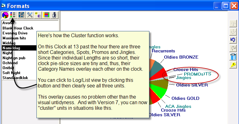
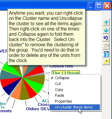
One of the things that’s always bothered us is what happens when you add several very short category units to a format clock. Since the pie slices are proportionally the size of the content of the catgeogry, and since the category name/label is linked to the “middle” of the pie slice, if we add a Station ID, followed by a Promo, followed by a Jingle, followed by a Voice Track then the category names over-lap resulting in a rather cluttered and untidy look. Sometimes you can’t see a category name because it’s covered by another category name. When that happens, you can click to switch from the Clock view to the Log view. But if you prefer to work in the clock view it can be a bit tedious switching back and forth
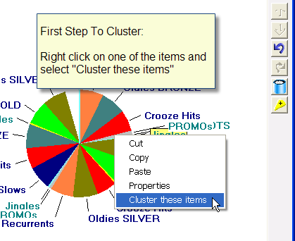
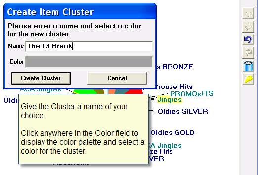
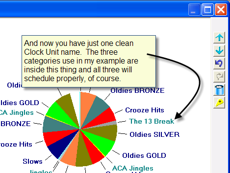
With Version 7, we’ve added a neat little solution. You can now “cluster” the short items so they display as just one unit. Everything is still there, all get scheduled properly, but the look of the clock is cleaner.
